

Learn Colour Theory in simple words. Discover the colour wheel, primary, secondary and tertiary colours, and understand how colours work together in art, painting, and design.
Colour Theory Explained: A Complete Beginner’s Guide to Understanding Colors
Have you ever wondered why some paintings look balanced and beautiful while others seem confusing or unpleasant?
The answer often lies in Colour Theory.
Colour Theory is the foundation of painting, drawing, digital art, graphic design, photography, fashion, and many other creative fields. It helps artists understand how colours interact, how they influence emotions, and how they can be combined to create visually appealing artwork.
Whether you’re using watercolor, acrylic, oil paints, coloured pencils, or digital painting software, understanding colour theory will make your artwork more attractive and professional.
The good news is that you don’t need to memorize hundreds of rules. Once you understand a few basic concepts, choosing and combining colours becomes much easier.
In this beginner-friendly guide, you’ll learn everything from the colour wheel to colour harmony using simple explanations and practical examples.
What Is Colour Theory?
Colour Theory is the study of how colours work together and how people perceive them.
It explains:
- How colours are created
- How colours can be mixed
- Which colours work well together
- How colours create mood and emotion
- How artists use colours to guide attention
Think of Colour Theory as the “grammar” of colours. Just as grammar helps us write better sentences, Colour Theory helps artists create better artwork.
Why Is Colour Theory Important?
Many beginners focus only on learning how to draw objects. However, colour selection is equally important because it affects how viewers experience the artwork.
Understanding Colour Theory helps you:
Create Better Artwork
Balanced colours make paintings look more attractive and professional.
Mix Colours Correctly
Instead of guessing, you’ll know which colours to combine to create new colours.
Improve Visual Balance
Good colour choices help important parts of your artwork stand out.
Express Emotions
Different colours create different feelings.
For example:
- Blue often feels calm.
- Red feels energetic.
- Yellow feels cheerful.
- Green feels natural.
Avoid Muddy Colours
Many beginners accidentally mix too many colours together, creating dull or muddy results.
Colour Theory teaches you how to avoid this common mistake.
Build Confidence
When you understand why colours work together, choosing paint becomes much easier.
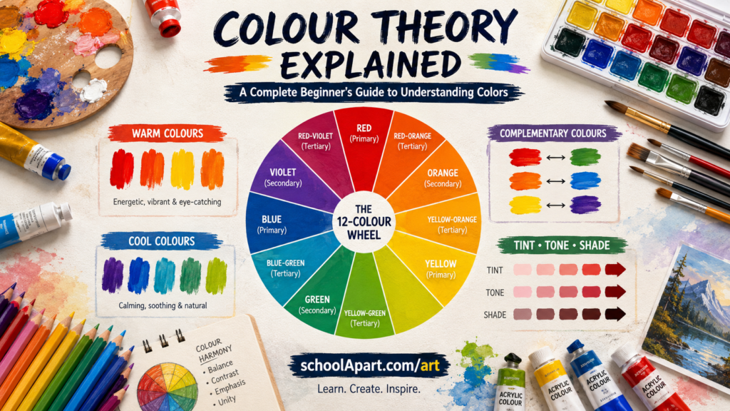
What Is the Colour Wheel?
The Colour Wheel is a circular diagram that shows how colours relate to one another.
It is one of the most important tools for artists.
The colour wheel helps you understand:
- Colour relationships
- Colour harmony
- Colour contrast
- Colour mixing
- Warm and cool colours
Most beginners learn Colour Theory by studying the colour wheel first.
Parts of the Colour Wheel
The traditional colour wheel is divided into three main groups:
- Primary Colours
- Secondary Colours
- Tertiary Colours
Together, these colours form the basis of almost every painting.
Primary Colours
Primary colours are the foundation of the colour wheel.
They cannot be created by mixing other colours.
The three traditional primary colours are:
- Red
- Yellow
- Blue
Every beginner should become familiar with these three colours before learning more advanced colour mixing techniques.
Why Are Primary Colours Important?
Primary colours are used to create almost every other colour on the colour wheel.
Without them, colour mixing would not be possible.
Artists use primary colours to:
- Mix secondary colours
- Create tertiary colours
- Build custom colour palettes
- Understand colour relationships
Secondary Colours
Secondary colours are created by mixing two primary colours in equal amounts.
| Primary Colours Mixed | Secondary Colour |
|---|---|
| Red + Yellow | Orange |
| Yellow + Blue | Green |
| Blue + Red | Purple (Violet) |
These colours are brighter and offer more variety than the three primary colours alone.
Uses of Secondary Colours
Orange
Often used for:
- Autumn scenes
- Sunsets
- Fruits
- Warm lighting
Green
Commonly used in:
- Trees
- Grass
- Forests
- Nature paintings
Purple
Popular for:
- Flowers
- Fantasy art
- Evening skies
- Decorative illustrations
Tertiary Colours
Tertiary colours are created by mixing one primary colour with one nearby secondary colour.
They add even more variety to an artist’s palette.
Common tertiary colours include:
- Red-Orange
- Yellow-Orange
- Yellow-Green
- Blue-Green
- Blue-Purple
- Red-Purple
These colours create smoother transitions between neighbouring colours and make artwork appear more natural.
Understanding the Colour Wheel Step by Step
Imagine the colour wheel as a clock.
At equal distances around the circle are the three primary colours.
Between them sit the secondary colours.
Between every primary and secondary colour sits a tertiary colour.
This creates a smooth transition from one colour to the next, making it easier to understand how colours relate to each other.
Colour Wheel Chart
| Colour Group | Colours |
| Primary | Red, Yellow, Blue |
| Secondary | Orange, Green, Purple |
| Tertiary | Red-Orange, Yellow-Orange, Yellow-Green, Blue-Green, Blue-Purple, Red-Purple |
This simple chart is one of the first references every beginner artist should remember.
Real-Life Examples of the Colour Wheel
Colour Theory isn’t limited to art classrooms. You see it every day.
Examples include:
Nature
- Blue sky
- Green trees
- Yellow flowers
- Orange sunsets
Food
- Red apples
- Yellow bananas
- Purple grapes
- Green vegetables
Sports
Team uniforms often use contrasting colours to improve visibility.
Traffic Signs
Bright colours help drivers notice important information quickly.
School Art Projects
Students use the colour wheel to create posters, paintings, greeting cards, and craft projects.
How Artists Use the Colour Wheel
Professional artists rarely choose colours randomly.
Instead, they use the colour wheel to:
- Select balanced colour combinations.
- Create realistic shadows.
- Build harmonious colour palettes.
- Draw attention to important subjects.
- Add contrast without making artwork look messy.
Understanding the colour wheel helps artists make confident creative decisions rather than relying on guesswork.
Beginner Activity: Build Your Own Colour Wheel
One of the best ways to learn Colour Theory is by making your own colour wheel.
Materials Needed
- Drawing paper
- Pencil
- Compass (optional)
- Ruler
- Watercolour, poster colours, or coloured pencils
- Eraser
Steps
- Draw a large circle.
- Divide it into 12 equal sections.
- Add the three primary colours.
- Fill in the secondary colours between them.
- Add the six tertiary colours.
- Label each colour clearly.
- Keep your completed colour wheel as a reference while practicing art.
Creating your own colour wheel helps you remember colour relationships much faster than simply reading about them.
Warm Colours vs Cool Colours
One of the most important concepts in Colour Theory is understanding the difference between warm colours and cool colours.
These groups influence the mood, energy, and atmosphere of an artwork.
What Are Warm Colours?
Warm colours are inspired by things associated with heat and sunlight.
Examples include:
- Red
- Orange
- Yellow
Some artists also include yellow-orange and red-orange in the warm colour family.
Characteristics of Warm Colours
Warm colours often feel:
- Energetic
- Bright
- Cheerful
- Exciting
- Friendly
- Powerful
Because they naturally attract attention, warm colours are often used as focal points in artwork.
Where Warm Colours Are Commonly Used
- Sunsets
- Fire
- Autumn leaves
- Flowers
- Fruits
- Cartoon illustrations
- Sports logos
What Are Cool Colours?
Cool colours are inspired by nature, water, and the sky.
Examples include:
- Blue
- Green
- Purple
These colours create a peaceful and relaxing atmosphere.
Characteristics of Cool Colours
Cool colours often feel:
- Calm
- Peaceful
- Relaxing
- Fresh
- Natural
- Elegant
Where Cool Colours Are Commonly Used
- Oceans
- Rivers
- Mountains
- Forests
- Winter scenes
- Night skies
Warm vs Cool Colours
| Warm Colours | Cool Colours |
|---|---|
| Red | Blue |
| Orange | Green |
| Yellow | Purple |
| Feel energetic | Feel calming |
| Appear closer | Appear farther away |
| Great for focal points | Great for backgrounds |
Professional artists often combine warm and cool colours to create balance and depth.
Neutral Colours
Neutral colours don’t strongly belong to either the warm or cool family.
Common neutral colours include:
- White
- Black
- Gray
- Brown
- Beige
These colours help balance bright compositions and make colourful elements stand out.
Uses of Neutral Colours
- Backgrounds
- Shadows
- Clothing
- Furniture
- Portraits
- Landscapes
Without neutral colours, many paintings would appear overly bright and visually overwhelming.
Tint, Tone, and Shade
These three terms are essential for anyone learning painting or digital art.
What Is a Tint?
A tint is created by adding white to a colour.
Example:
- Red + White = Pink
Tints are:
- Lighter
- Softer
- More delicate
Common uses include:
- Clouds
- Flowers
- Children’s illustrations
- Soft lighting
What Is a Shade?
A shade is created by adding black to a colour.
Example:
- Blue + Black = Dark Blue
Shades are:
- Darker
- Stronger
- More dramatic
Artists use shades for:
- Shadows
- Night scenes
- Depth
- Contrast
What Is a Tone?
A tone is created by adding gray to a colour.
Tones appear:
- Softer
- Less intense
- More natural
They are commonly used in:
- Portrait painting
- Interior illustrations
- Landscape art
Tint vs Tone vs Shade
| Term | How It’s Made | Result |
| Tint | Colour + White | Lighter colour |
| Tone | Colour + Gray | Softer colour |
| Shade | Colour + Black | Darker colour |
Understanding these three concepts gives artists much greater control over colour.
What Is Colour Harmony?
Colour Harmony refers to combinations of colours that look balanced and pleasing together.
Instead of choosing colours randomly, artists use harmony rules to create attractive artwork.
Good colour harmony helps:
- Guide the viewer’s eye.
- Create visual balance.
- Avoid colour clashes.
- Build mood and atmosphere.
Complementary Colours
Complementary colours sit opposite each other on the colour wheel.
Examples:
- Red ↔ Green
- Blue ↔ Orange
- Yellow ↔ Purple
These pairs create strong contrast.
Artists often use complementary colours to make important subjects stand out.
Examples:
- Red flower on green leaves
- Orange sunset against a blue sky
- Yellow stars in a purple night sky
Analogous Colours
Analogous colours are neighbours on the colour wheel.
Examples:
- Yellow
- Yellow-Green
- Green
or
- Blue
- Blue-Green
- Green
These colour combinations create smooth and natural-looking artwork.
They are commonly used for:
- Landscapes
- Nature scenes
- Backgrounds
Triadic Colours
Triadic colour schemes use three colours that are evenly spaced around the colour wheel.
Example:
- Red
- Yellow
- Blue
Another example:
- Orange
- Green
- Purple
Triadic palettes feel:
- Bright
- Balanced
- Colourful
They are popular in:
- Children’s books
- Cartoons
- Educational illustrations
- Posters
Split-Complementary Colours
A split-complementary palette starts with one colour and uses the two colours beside its complementary colour.
Example:
Instead of:
Blue + Orange
Use:
- Blue
- Red-Orange
- Yellow-Orange
This creates strong contrast while feeling slightly softer than true complementary colours.
Tetradic (Rectangle) Colour Scheme
A tetradic colour scheme uses four colours arranged as two complementary pairs.
Example:
- Red
- Green
- Blue
- Orange
This palette provides a wide range of colours but requires careful balance.
Professional illustrators often use tetradic schemes in complex artwork.
Monochromatic Colours
A monochromatic colour scheme uses one base colour together with its different tints, tones, and shades.
Example:
Blue
↓
Light Blue
↓
Sky Blue
↓
Blue
↓
Dark Blue
↓
Navy Blue
This style creates elegant, clean, and harmonious artwork.
Monochromatic palettes are often used in:
- Minimalist illustrations
- Logos
- Character design
- Digital artwork
Colour Mixing Basics
Every beginner should learn a few simple colour-mixing rules.
Mix Two Primary Colours
You create a secondary colour.
Examples:
- Red + Yellow = Orange
- Yellow + Blue = Green
- Blue + Red = Purple
Add White
You create a tint.
Add Black
You create a shade.
Add Gray
You create a tone.
Mix Carefully
Always begin with small amounts of paint.
Adding too much of one colour makes it difficult to return to the original mixture.
Common Colour Theory Mistakes Beginners Make
Everyone makes mistakes while learning Colour Theory.
Here are some of the most common ones.
Using Too Many Colours
Trying to use every colour in one painting often creates a messy composition.
A limited colour palette usually produces stronger artwork.
Ignoring the Colour Wheel
Choosing colours randomly can make a painting feel unbalanced.
The colour wheel is one of the artist’s most valuable references.
Overmixing Paint
Mixing too many colours together often creates dull, muddy colours.
Most artists recommend mixing no more than two or three colours at a time.
Forgetting Warm and Cool Colours
Using only warm or only cool colours can make artwork feel flat.
Balancing both groups creates depth and visual interest.
Using Pure Black for Every Shadow
Real-life shadows often contain subtle blues, purples, or browns rather than pure black.
Observing real objects helps artists create more natural-looking shadows.
Simple Colour Theory Exercises
The best way to understand Colour Theory is through practice.
Try these beginner-friendly activities:
Exercise 1
Create your own 12-colour wheel.
Exercise 2
Paint one object using only warm colours.
Exercise 3
Paint the same object again using only cool colours.
Exercise 4
Mix as many shades as possible from a single colour.
Exercise 5
Create a painting using only complementary colours.
Exercise 6
Create another painting using an analogous colour palette.
These simple exercises will improve your understanding of colour relationships much faster than reading alone.
Colour Theory in Different Types of Art
Colour TheoColour Theory Explainedry is useful in almost every creative field. Although the basic principles remain the same, different types of artists use colours in different ways.
Drawing
Even pencil artists benefit from understanding Colour Theory.
When using coloured pencils, markers, or pastels, Colour Theory helps artists:
- Choose harmonious colour combinations.
- Add realistic highlights and shadows.
- Create depth and contrast.
- Make important objects stand out.
Watercolor Painting
Watercolor paints are transparent, making colour choices especially important.
Artists use Colour Theory to:
- Mix clean colours.
- Create soft gradients.
- Avoid muddy paintings.
- Build balanced landscapes and nature scenes.
Acrylic Painting
Acrylic paints are vibrant and versatile.
Colour Theory helps acrylic artists:
- Layer colours effectively.
- Create bold contrasts.
- Mix accurate colours.
- Design eye-catching artwork.
Oil Painting
Oil painters often work with multiple layers.
Understanding Colour Theory helps them:
- Create realistic skin tones.
- Balance warm and cool colours.
- Produce natural-looking shadows.
- Build smooth colour transitions.
Digital Art
Digital artists use Colour Theory every day.
It helps them:
- Design characters.
- Create attractive user interfaces.
- Paint digital illustrations.
- Improve game and animation artwork.
Graphic Design
Designers rely on Colour Theory to:
- Build strong brand identities.
- Design readable posters.
- Improve website interfaces.
- Create attractive advertisements.
Colour Psychology (Beginner’s Introduction)
Colours influence how people feel and respond to images. While personal experiences and cultures can affect interpretation, many colours are commonly associated with certain moods.
| Colour | Common Associations |
|---|---|
| Red | Energy, passion, excitement |
| Orange | Enthusiasm, creativity, warmth |
| Yellow | Happiness, optimism, attention |
| Green | Nature, growth, freshness |
| Blue | Calm, trust, stability |
| Purple | Imagination, creativity, elegance |
| Pink | Kindness, softness, playfulness |
| Brown | Earth, reliability, comfort |
| Black | Strength, sophistication, mystery |
| White | Simplicity, cleanliness, peace |
Artists use these associations to support the message or atmosphere of their artwork.
A Simple Colour Theory Practice Plan
Learning Colour Theory becomes easier with regular practice.
Day 1
Draw and label a 12-colour wheel.
Day 2
Practice mixing primary colours to create secondary colours.
Day 3
Create tertiary colours by mixing neighbouring colours.
Day 4
Paint one object using only warm colours.
Day 5
Paint the same object using only cool colours.
Day 6
Create artwork using complementary colours.
Day 7
Paint a small landscape using an analogous colour scheme.
Repeating these exercises over several weeks will improve your understanding of colour relationships.
Quick Colour Theory Cheat Sheet
| Concept | Quick Explanation |
| Primary Colours | Red, Yellow, Blue |
| Secondary Colours | Orange, Green, Purple |
| Tertiary Colours | Mix of a primary and a neighbouring secondary colour |
| Warm Colours | Red, Orange, Yellow |
| Cool Colours | Blue, Green, Purple |
| Tint | Colour + White |
| Tone | Colour + Gray |
| Shade | Colour + Black |
| Complementary Colours | Opposite on the colour wheel |
| Analogous Colours | Next to each other on the colour wheel |
| Triadic Colours | Three evenly spaced colours |
| Monochromatic | One colour with different tints, tones, and shades |
Save this table as a quick reference whenever you paint or design.
Key Takeaways
- Colour Theory explains how colours relate to one another.
- The colour wheel is the foundation of colour learning.
- Primary colours create secondary and tertiary colours.
- Warm and cool colours influence mood and visual balance.
- Tints, tones, and shades expand your colour options.
- Colour harmony helps artists create attractive compositions.
- Practising colour mixing is just as important as studying colour rules.
- Understanding Colour Theory improves drawing, painting, digital art, and design skills.
Frequently Asked Questions (FAQ)
1. What is Colour Theory?
Colour Theory is the study of how colours interact, combine, and create visually pleasing results in art and design.
2. Why is Colour Theory important?
It helps artists choose colours confidently, create balanced artwork, mix paints accurately, and communicate mood effectively.
3. What are the primary colours?
In traditional art education, the primary colours are Red, Yellow, and Blue.
4. What are secondary colours?
Secondary colours are created by mixing two primary colours:
- Red + Yellow = Orange
- Yellow + Blue = Green
- Blue + Red = Purple
5. What are tertiary colours?
Tertiary colours are formed by mixing a primary colour with a neighbouring secondary colour, such as Yellow-Green or Blue-Purple.
6. What are warm colours?
Warm colours include reds, oranges, and yellows. They often create feelings of warmth, energy, and excitement.
7. What are cool colours?
Cool colours include blues, greens, and purples. They are commonly associated with calmness, nature, and relaxation.
8. What is the colour wheel?
The colour wheel is a visual chart that shows how colours are related and helps artists create harmonious colour combinations.
9. What are complementary colours?
Complementary colours are opposite each other on the colour wheel, such as Blue and Orange or Red and Green.
10. What is the difference between a tint, tone, and shade?
- Tint: A colour mixed with white.
- Tone: A colour mixed with gray.
- Shade: A colour mixed with black.
11. Can I learn Colour Theory without painting?
Yes. Colour Theory is useful for drawing, graphic design, digital art, photography, fashion, and many other creative fields.
12. How can beginners practise Colour Theory?
Start by creating a colour wheel, mixing basic colours, experimenting with warm and cool palettes, and painting simple objects using different colour schemes.
13. Do professional artists still use Colour Theory?
Yes. Professional artists regularly use Colour Theory to plan compositions, balance colours, and create realistic or expressive artwork.
14. Is Colour Theory difficult to learn?
No. The basics are straightforward, and regular practice makes it much easier to understand and apply.
15. What is the best way to remember Colour Theory?
Practice regularly, keep a colour wheel nearby, and experiment with different colour combinations instead of memorising rules alone.
Colour Theory is one of the most valuable skills every artist can learn. It provides the knowledge needed to understand how colours work together, how they influence mood, and how they can transform ordinary artwork into visually engaging creations.
By learning the colour wheel, primary, secondary, and tertiary colours, along with concepts such as warm and cool colours, tints, tones, shades, and colour harmony, you’ll make more confident artistic decisions and improve the quality of your work.
Remember that mastering Colour Theory doesn’t happen overnight. Like drawing or painting, it develops through observation, experimentation, and consistent practice. Start with simple exercises, explore different colour combinations, and don’t be afraid to make mistakes—they’re an important part of learning.
As your understanding grows, you’ll notice improvements not only in painting but also in drawing, digital art, graphic design, and other creative projects.
Every great artwork begins with a good idea, but the right colours help bring that idea to life.








Leave a Reply